
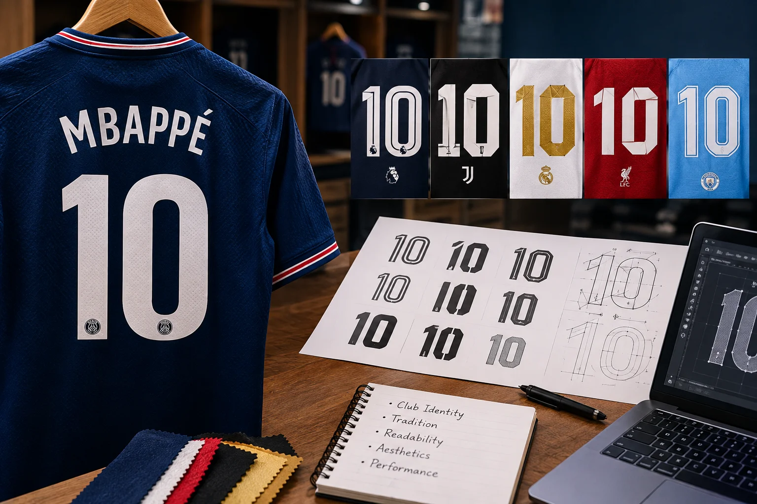
The number on the back of a football shirt is one of the most looked-at pieces of typography in the world, and almost nobody notices it. That is by design. A good number font is legible from the far end of a stadium, distinctive enough to belong to its competition or club, and clean enough not to fight with the shirt underneath.
Who chooses it, and how, says a lot about how football is organised.
Who decides which font a club uses?
It depends on the competition, and that is the first thing to understand.
Some competitions require every club to use the same font, so that numbers are consistent across all matches and easy for officials and broadcasters to read. The Premier League has used a standard font for all clubs for many years, updated periodically. In other competitions, clubs are free to use their own fonts, which are usually designed by the kit manufacturer as part of the shirt.
That means the same club may wear one font in its domestic league and a different one in a cup or European competition, in the same season, on otherwise identical shirts.
Why do competitions standardise fonts?
Legibility and branding, in that order.
A single font across a competition means officials, broadcasters and supporters see consistent numbers in every match, which reduces confusion. It also gives the competition a visual identity, since the font becomes associated with the league itself. The manufacturers of the font often include small details that reference the competition.
The trade-off is that clubs lose a small piece of their own identity, and manufacturers lose a design element they would otherwise control.
What makes a good number font?
Legibility first, at distance and at speed.
A number has to be readable from a hundred metres away, on a moving player, in poor light, by a referee trying to identify who committed a foul. That rules out anything too ornate. The strokes need to be thick enough to be seen and distinct enough that a three cannot be mistaken for an eight, or a one for a seven.
Beyond that, fonts are designed to suit the shirt. Numbers on a striped or patterned shirt often sit on a solid block to keep them readable. Colours are chosen for contrast against the base colour, which is why the same font may appear in different colours on home and away kits.
Printing methods have changed too. Older shirts used flock, a fuzzy textured material, or sewn-on numbers. Modern shirts use heat-applied vinyl or, at the top level, lightweight materials designed not to add weight to a player version. The material is another era marker, and a flock number on a shirt from a season when vinyl was standard is a sign something has been changed.
How are names handled?
With a matching letter set, designed alongside the numbers, and with rules about length.
Player names above the number use a font designed to match the numbers, in a smaller size. Competitions set rules on which name a player may use, how many characters are allowed and how the name must be spaced. Long names are compressed rather than made smaller, which is why some names look noticeably tighter than others.
The name and number together are usually applied by heat transfer on modern shirts, in a material chosen to survive washing without cracking.
Colour matters as much as shape. A number that reads perfectly in black on a white shirt may vanish in the same black on a navy one, so competitions specify approved colour combinations for each base colour and manufacturers test them under floodlights before a season begins.
Why do fonts change?
Because competitions and manufacturers update them, and because supporters get used to them.
Competition fonts are refreshed every few seasons as part of wider branding changes. Manufacturer fonts change more often, sometimes every season alongside the shirt. Each change gives the shirt a slightly different character, and supporters who grew up with one font often feel that later ones look wrong.
For collectors, those changes are useful, which brings us to the practical point.
Do goalkeepers use the same font?
Yes, in competitions with a standard font, and it creates a design problem.
Goalkeeper shirts are often in bright or patterned colours to stand out, and the standard font has to remain legible against all of them. That is why goalkeeper numbers frequently appear in a different colour from the outfield players’ numbers in the same match, and why a solid block behind the number is more common on goalkeeper shirts.
What do fonts reveal about a shirt?
Its era, often more precisely than anything else on the back.
Because fonts change on a known schedule, the number style on a printed shirt can place it to a specific competition and season. A shirt printed in a font that does not match the claimed season is one of the clearest signs that it is not what the listing says. Replica printing services sometimes use approximations of official fonts, and the differences, though small, are visible to anyone who knows the original.
Our guide to verifying a Spurs shirt against its description covers how fonts fit alongside the other season markers.
Why are some numbers on a solid block?
Because the shirt underneath would make them unreadable otherwise.
On striped, hooped or heavily patterned shirts, a number applied directly to the fabric disappears into the pattern from a distance. The solution is a solid rectangle behind the number, in a contrasting colour, which restores legibility at the cost of interrupting the design. Competitions often require it for shirts where the pattern would otherwise compromise the number.
The block itself has become part of certain clubs’ identity, and supporters of striped clubs tend to have strong opinions about its shape and colour.
What about retro shirts and reproductions?
Reproductions of older shirts sometimes use modern fonts on old designs, which is a giveaway.
An original shirt from the 1990s carries the numbering of its time, often simpler and heavier than modern fonts. A reproduction that applies today’s competition font to a 1990s design has reproduced the shirt but not the shirt’s era. For anyone buying a reproduction for authenticity, checking the number style against period photographs is worthwhile.
The next time a new season’s shirts are revealed, look at the numbers before the design. They will tell you which competition the club expects to play in, which manufacturer made the shirt, and sometimes which era the designers were trying to evoke. It is a small piece of the kit that carries a surprising amount of information.
Frequently asked questions
Who chooses the font on a football shirt?
Either the competition, which may require a standard font for all clubs, or the kit manufacturer, which designs a font as part of the shirt for competitions that allow it.
Why does the Premier League use one font for all clubs?
For consistency and legibility across every match, and to give the competition a visual identity of its own.
Can you date a football shirt from the number font?
Often, yes. Fonts change on a known schedule, so the number style on a printed shirt usually places it to a specific season and competition.